Storyboard

Posted: 25th September 2012 by e10391 in Uncategorized

 What is a storyboard?

Once a concept or script is written for a film or animation, the next step is to make a storyboard. A storyboard visually tells the story of an animation panel by panel, kind of like a comic book.

Your storyboard should convey some of the following information:

  • What charaters are in the frame, and how are they moving?
  • What are the characters saying to each other, if anything?
  • How much time has passed between the last frame of the storyboard and the current one?
  • Where the “camera” is in the scene? Close or far away? Is the camera moving?

 Why make a storyboard?

 Creating a storyboard will help you plan your animation out shot by shot. You can make changes to your storyboard before you start animating, instead of changing your mind later. You will also be able to talk about your animation and show your storyboard to other people to get feedback on your ideas.

 How do I make a storyboard?

 Most commonly, storyboards are drawn in pen or pencil. If you don’t like to draw you can also take photos, cut out pictures from magazines, or use a computer to make your storyboards. Keep in mind that your drawings don’t have to be fancy! In fact, you want to spend just a few minutes drawing each frame. Use basic shapes, stick figures, and simple backgrounds. If you draw your storyboard frames on index cards, you can rearrange them to move parts of the the story around.

 Examples:

 Here is the storyboard and commercial for a car so you can get the idea.

 his was done as a possible TV commercial campaign for Taco Bell called “Tested on Animals”. The idea was for Taco Bell Scientists to take college student subjects into their lab and study the further possibilities of the tacos. I worked under Jeffery Hyman’s (Cog1.com) creative direction.

 Assignment:

Plan your own commercial! 

1. Choose the Product

   1. Must be a real product.

   2. Must be able to bring product to school

   3. Must be able to shoot commercial at school

   4. Must be approved by teacher.

2. Study the product

   A. What’s unique?

   B. Why is it better?

   C. How can it be positioned amongst the competition?

3. Identify and study the target audience.

   A. Who likes this type of product?

   B. How will the target audience use the product?

   C. How can the product gain recognition from the target audience?

4. Design an advertising campaign

   A. Choose one of the Persuasive techniques 

   B. Motivate audience to action – buy product, vote for candidate, etc.

3. Make a storyboard

   1. Include at least 6 frames

   2. Include different size shots

   3. Sketch or take pictures to show the different shots

   4. Use arrows to show movement

   5. Write a description of the commercial as well.

Commercials

Posted: 25th September 2012 by e10391 in Uncategorized

Advertising – a marketing tool that helps sell brands of products and helps to build confidence in companies and institutions. It conveys accurate and compelling information about the brand or company and institution.

Four Characteristics of Advertising

1. It is paid for by an organization or individual.

2. It is persuasive.

3. It has an identifiable sponsor.

4. It is carried in a medium (TV print, radio)


TELEVISION ATTRACTS LARGER PERCENTAGE OF NATIONAL ADVERTISING DOLLARS. NO OTHER MEDIUM CAN REACH A LARGER OR MORE DIVERSE AUDIENCE WITH A NATIONALLY ADVERTISED PRODUCT.

PERSUASIVE DEVICES

1. Testimonial – a famous person or believable person promotes or says he or she is committed to this cause.

http://www.youtube.com/watch?v=WWbGGwN8qYU

2. Humor – the use of comedy to promote a cause.

Dirt Devil – The Exorcist

Mountain Dew – Bohemian Rhapsody

3. Plain Folks – common people say it is a good cause, so you are supposed to think they are honest like you are and are telling you the truth.

Subway – Jared

4. Bandwagon – everyone is joining or doing it, so you should too.

Coca-Cola – Chihuahua

5. Transfer – associating one positive thing with another, different thing.

Coca-Cola – Christmas

6. Urgency – there is no time to delay. HURRY! RUN!

Regency Furniture

7. Heartstring – an appeal to your emotion. You feel guilty if you don’t contribute to

the cause.

Iphone – Meet Her

Camera Shots!

Posted: 25th September 2012 by e10391 in Uncategorized

For our next project, you will create commercials in groups.  We will now begin using actual moving film instead of just still photos.  On this assignment I want you to focus on using a variety of shot sizes and angles.

As filmmakers, you have the power of manipulating the audience’s field of view.  You decide what the public sees and how.  Shot sizes are important for variety, and to control what the audience focuses on. 

(information from elementsofcinema.com)

Wide/Long Shot

Long shots are used to emphasize the scenery or the location around the subject. Oftentimes, a wide shot comprises of sweeping land or cityscapes. A long shot of a family eating long shotat the dinner table would, perhaps, be recorded from the living room.

The picture to the right is a frame from Gone with the Wind (1939). A long shot is employed to emphasize the tragedy of the Civil War and its causalities. Can you find Scarlet O’Hara in the picture?

Wide shots require wide-angle lens to show a vast location.

Establishing Shot and Master Shot

An establishing shot and a master shot are not the same per se. But they were compiled as one distinct category because the framing and the composition is usually the same for both of them.

An establishing shot introduces a new location – a church, a city street, a rooftop, a hospital room – from a vantage point that allows the audience to see all the relevant characters in the fiestablishing shotlmic space. A master shot would probably be recorded from the same position, with the same lens, also showing all the characters. The difference is the length. A master shot records the entire action, a complete run-through from that camera position. That way if a tighter shot is forgotten during coverage, the director knows her editor will have enough material to show the scene in its entirety by cutting back to the master shot. An establishing shot would not last more than ten seconds in the edited movie, while a master shot could last a few minutes.

To a sense, master shots are usually part of cinematography terminology because they should be standard practice for every new scene. Establishing shots, in the other hand, refer more to the editing phase of the movie, when the editor selects one quick angle to reveal the location.

Also, note that an establishing shot doesn’t necessarily mean that we see the character’s full body. Basically, the establishing shot displays the elements needed for the scene to function. An establishing shot of a man at a type writer would most likely show only him and the type writer.

The Film Historian’s Insight

During the first years of cinema, the most common type of shot was the long shot. Back in 19th century, when cinema was still young, there were no filmmakers; there were only camera operators. These operators were interested in sceneries because that’s what the audience wanted – to be transported to different locales. The camera (then called the cinamatographe) was traveling to distant countries and capturing exotic images around the globe. Close-ups were rare.

The great train robbery

When impresarios (arguably the first filmmakers) decided to use the cinematographe to record scripted stories, establishing shots became common. They were preferred because the camera would record scenes with a similar vantage point as theater audiences would have. In that time, the film grammar, which incorporates, among other things, editing and shot variety, hadn’t been developed.

It wasn’t until D. W. Griffith came along that medium shots, close-ups, and insert shots were comprehended and used effectively. D. W. Griffith changed the game because his films abound with shot variety. He knew the purposes of the different shot sizes.


Full Shot (FS)

A full shot displays the character from head to toe, without showing much of his surroundings (or else it would be considered a long shot). These shots were very popular in the beginning of cinema before filmmakers had understood the power of medium shots and close-ups.

A full shot distances the character from the viewer both phyfull shotsically and psychologically. They carry less emotional weight, and therefore they are not the best choice during emotive scenes.

Whenever the director wants to convey someone’s anger, fear, or joy, close-ups are way more effective. A full shot would be welcome if a character is having an epileptic seizure, for instance.

Medium Shot (MS)

Medium shots are the most common types of shots in the movies. Showing most of the subject’s body, medium shots are halfway between long shots and close-ups; however, authormedium shots disagree on the definition. While some writers declare that the medium shot shows the character from a little above the knees to the top of his head, others state that medium shots only go as low as a little above the waist. Regardless of the debate, general composition rules demand that frame lines shouldn’t cut the actors on the joints, so as long as operators avoid knees, waists, and elbows the framing shouldn’t be a problem.

The medium shot also encompasses two other famous shot types: The two-shot, with two actors facing the same screen direction, and the over-the-shoulder, showing a conversation in which the actors sit or stand across from each other.

To record medium shots, a normal lens will suffice.

Close-Up (CU)

In close-up shots, the subject dominates most of the frame, allowing very little observation on the locale of the scene. Close-ups are much more dramatic than long or medium shots. They are preferred when conveying someone’s emotion: close up

Extreme Close-Up (ECU)

Often labeled as detail shot, extreme close-ups do exactly that: show a small detail of certain relevance that would otherwise be missed in a longer shot. extreme close up

For close-ups and extreme close-ups, telephoto lens are more appropriate.

Insert Shots

Insert shots don’t focus on people. They are employed to emphasize a relevant object, such as a letter, an envelope with money, or a gun that would otherwise be lost in the grand mise-en-scène. Insert shots are tight shots in which objects fill most of the frame. Even if inserts don’t reveal anything new, they are still welcome during the editing phase, as they smooth transitions between shots, often serving as a neutral shot that allows a breach of the 180 degree rule.

insert shot

Reaction Shots

Reaction shots are often forgotten by camerapersons and incredibly needed by editors. They comprise of a cutaway – usually a close-up – of an actor reacting to something, like a conversation or a speech, though it can be pretty much anything. Reaction shots are customarily deprived of dialogue, but not always. The actor’s reaction may be a sneer, furrowed browns, a grin, or any other gesture that conveys an emotion; or just an expressionless stare.

reaction shot

The Filmmaker’s Insight

The reason why reaction shots are needed is because they allow the editor to cut away from the main action, thus allowing some flexibility on the assembly of shots. Suppose that the camera operator captured two takes of an actor’s speech that lasted 1 minute long. Now imagine that the first half of the actor’s speech is more powerful in the first take, while the second half is better in the second take. Without the reaction shot, the editor only has two choices: take 1 or take 2. However, with the reaction shot of a secondary character, the editor has a third choice: he can bridge the first take and the second take by cutting away to the reaction shot during the transition from one take to the other.

Digital Story Assignment

Posted: 6th September 2012 by e10391 in Uncategorized

Make a digital story about your object.  It could be from 1 minute to 3 minutes long.

Include photos, recorded voice, music, and text.  Include a title at the beginning and credits at the end.

Make your message clear and simpleWhat do you want to say about your object and yourself?  How will you say it?  You have some options:

Visual resources:

Photos edited on Photoshop to fit your color scheme

Your own photos from home (edit to match your color scheme)

A photo of your artwork about your object

Audio Resources:

Interview: Splice it up and use the good parts

Recorded Object Story

Recorded 6 word Story

Your ideas?

Text Resources:

Title

Portions of your Object story in text form

6 word story in text form

Credits

Your ideas?

Music: Choose music that evokes the rhythm and pace of your story. The most effective tracks are often instrumental: classical, ambient, folk or jazz, with no vocals, which can distract.

Freeplay Music (legal), great resource

Your own Music (illegal)

Mp3 form

Focus on having a clear color scheme, a clear message, and clean editing.  At every step, ask yourself:

Does this enhance my story or confuse it?

 Have fun and make something you’ll be proud of!

Rubric For Grading: 

Category

4 Points

3 Points

2 Points

1 Point

1. Purpose of Story Establishes a purpose early on and maintains a clear focus throughout. Establishes a purpose early on and maintains focus for most of the presentation. There are a few lapses in focus, but the purpose is fairly clear. It is difficult to figure out the purpose of the presentation.          
2. Point of View The point of view is well developed and contributes to the overall meaning of the story. The point of view is stated but does not connect with each part of the story, although an attempt is made to connect it to the overall meaning of the story. The point of view is stated but no attempt is made to connect it to the overall meaning of the story. The point of view is only hinted at, or is difficult to discern.
3. Choice of Content Contents create a distinct atmosphere or tone that matches different parts of the story. The images may communicate symbolism and/or metaphors. Contents create an atmosphere or tone that matches some parts of the story. The images may communicate symbolism and/or metaphors. An attempt was made to use contents to create an atmosphere/tone but it needed more work. Image choice is logical. Little or no attempt to use contents to create an appropriate atmosphere/tone.
4. Clarity of Voice Voice quality is clear and consistently audible throughout the presentation. Voice quality is clear and consistently audible throughout the majority (85-95%) of the presentation. Voice quality is clear and consistently audible through some (70-84%)of the presentation. Voice quality needs more attention.
5. Pacing of Narrative The pace (rhythm and voice punctuation) fits the story line and helps the audience really “get into” the story. Occasionally speaks too fast or too slowly for the story line. The pacing (rhythm and voice punctuation) is relatively engaging for the audience. Tries to use pacing (rhythm and voice punctuation), but it is often noticeable that the pacing does not fit the story line. Audience is not consistently engaged. No attempt to match the pace of the storytelling to the story line or the audience.
6. Meaningful Audio Soundtrack Music stirs a rich emotional response that matches the story line well. Images coordinated with the music. Music stirs a rich emotional response that somewhat matches the story line. Images mostly coordinated with the music. Music is ok, and not distracting, but it does not add much to the story. Not coordinated with images. Music is distracting, inappropriate, OR was not used.
7. Quality of Images Images create a distinct atmosphere or tone that matches different parts of the story. The images may communicate symbolism and/or metaphors. Images create an atmosphere or tone that matches some parts of the story. The images may communicate symbolism and/or metaphors. An attempt was made to use images to create an atmosphere/tone but it needed more work. Image choice is logical. Little or no attempt to use images to create an appropriate atmosphere/tone.
8. Color Scheme Film has a clear color scheme.  All Images utilize colors from your color palette in an enhancing and attractive way. Most photos match your color scheme. Photos edited with color, but the color seems random and follows no set scheme or your palette. Little to no attempt to edit photos was made.
9. Economy of Story Detail The story is told with exactly the right amount of detail throughout. It does not seem too short nor does it seem too long The story composition is typically good, though it seems to drag somewhat OR need slightly more detail in one or two sections. The story seems to need more editing. It is noticeably too long or too short in more than one section. The story needs extensive editing. It is too long or too short to be interesting.
10. Grammar and Language Usage Grammar and usage were correct (for the dialect chosen) and contributed to clarity, style and character development. Grammar and usage were typically correct (for the dialect chosen) and errors did not detract from the story. Grammar and usage were typically correct but errors detracted from story Repeated errors in grammar and usage distracted greatly from the story.


Recording Audio 2

Posted: 5th September 2012 by e10391 in Uncategorized

In a quiet place, read your object story aloud and record it.  If you mess up while reading, redo that part!  You can edit it later.

Record your 6 word story too.  Experiment with it, have fun.  Chant it, sing it, give it a pulse or rythm.

Record anything else relevant to your digital story. I am open to your ideas.

Recording Audio

Posted: 4th September 2012 by e10391 in Uncategorized

Today you will learn to record audio files for your movie.  You will interview each other in partners about your objects.  This is to learn how to record and possibly use in your movie.

Step 1:  Write 5 interview questions for your partner.  Tip:  write open ended questions.  You want them to talk a lot!

example of a closed ended question:

Q: Do you like the guitar?

A: Yes.

example of an open ended questions

Q: What kind of musician do you consider yourself?

A: blah blah blah, Jimi Hendrix, blah blah blah….

POST YOUR INTERVIEW QUESTIONS ON YOUR BLOG FOR A GRADE!

Another tip, as the interviewer, try to get them to expandon their thoughts by asking questions like:

Why, How, and Tell Me More!

2. Open Programs –> Sony –> Vegas Movie Studio 6.0–>Vegas Movie Studio 6.0

3. Plug in the microphone/headsets into the front of your computer, white cord on top, red cord on bottom

4. Click Help –> Show Me How –> How to Record Audio.  Follow the tutorial, its easy! 

5. Once you get it, begin your interview.  Have the person who is being interviewed wear the headset and record onto their computer! Save the movie file!

Photo Color Editing

Posted: 31st August 2012 by e10391 in Uncategorized

I asked you to create a color palette for your movie.  Here’s some suggestions of how you can apply it to your photos:

On Photoshop, adjust:

Hue/Saturation

Desaturate, Add Color

Draw on Top

Change Color of Selected Area

Photo Shoot!

Posted: 29th August 2012 by e10391 in Uncategorized

Today I am giving you class time to do a photo shoot of your object.  Have fun!  Be Creative!  Be productive!  Remember your COLOR PALETTE!

Photograph your piece from 3 different angles

Get close, crop out some of your object

3 shots of You with your object

A Shadow of your object

Some sort of reflection with your object

Rule of Thirds photo:

Experiment with Stop Motion Animation


6 Word Story

Posted: 28th August 2012 by e10391 in Uncategorized

Sometimes simple is good.  In the 1920s, Ernest Hemingway’s colleagues bet him that he couldn’t write a complete story in just six words. They paid up. Hemingway is said to have considered it his best work.

“For sale: baby shoes, never used.” – Ernest Hemingway

Write a 6 word story about your object and post it on your blog under 6 word Story.  Take the time to think about it!

My example: Black, white, opposing forces create unity.

here are some more examples.

Color Palette in Film

Posted: 27th August 2012 by e10391 in Uncategorized


“Human responses to color are not purely visual responses; they are also psychological or even physiological” TAOWF

This means that when you see a certain color, it not only affects your eyes but your mind and your entire body.  “Decorating restaurants in red apparently stimulates the appetite and results in increased food consumption.  Blue surroundings can significantly lower human blood pressure, pulse and respiration rates.  And violent children relax, become calm, and often fall asleep in a small room painted bubble-gum pink.” TAOWF

Colors often have different meanings in various cultures.  In western cultures, a bride typically wears white on her wedding day.  In medieval times, she would wear green.  Can you guess what those two colors represent?

When the movie industry began, movies could only be filmed in black and white.  In the early 1900s some black and white movies were hand painted in color, frame by frame.  This process was extremely tedious and expensive!

A Trip to the Moon by George Méliès 1902

The next step in color film was the process of tinting, coloring the film stock before the image was printed on it.  This produced two colors, black, and whatever color was used to tint the film.  This process was popular during the silent era, with specific colors employed for certain story lines.

The Diabolical Church Window by George Méliès 1910

 By the 1920s, cameras had been invented that could capture color.  However, it was 30% more expensive than filming in black and white, and the color quality was poor, specifically caucasian skin tone, which appeared bright pink or orange. 

 The most successful early color movies were Gone with the Wind and The Wizard of Oz, both released in 1939 in technicolor

Today we take color film for granted, it is the norm.  Color is one of the elements of a movie, and filmmakers routinely manipulate it for a purpose. The color in a film can be controlled through film choice, filters, lighting, costumes, make-up backgrounds, and sets.

Some ways that color is used:

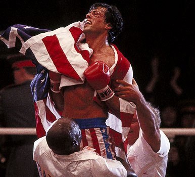
 Color Attracts Attention.  By using bright or saturated colors on the object of greatest interest and placing that object against a contrasting background, the director can easily capture the viewers eye.

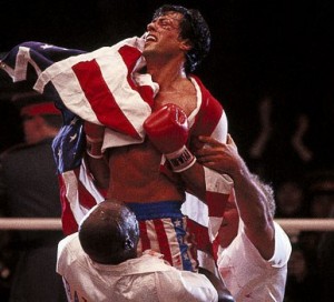
A saturated red is a great attention getter, used here in Rocky IV

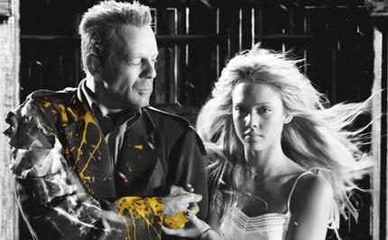
Sin City was shot in black and white, but at crucial moments, splashes of color add dramatic intensity.

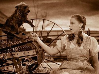
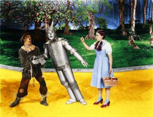
Color as a Transitional Device.  Color is often used to signal important changes.  This can be accomplished by using color in conjunction with black and white or by switching to an obviously different color emphasis or style at the point of transition.  In The Wizard of Oz, the dull, drab Kansas of Dorothy’s real world suddenly becomes the glowing Technicolor Oz of her dream.

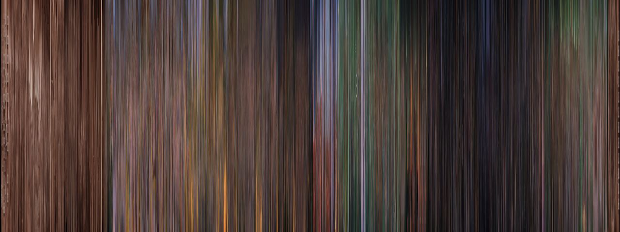
Here is a Movie Barcode of The Wizard of Oz.  Movie Barcode compresses every frame of a movie into a single image.  Notice the Transition from the Beginning of the Film, which is Sepia-Toned, to the Technicolor World of Oz.

Kansas

Oz

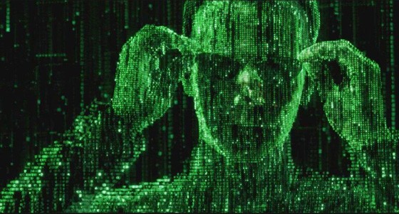
In The Matrix, the Wachowski brothers use color to help the audience understand the complex narrative. Scenes with a green tint indicate that the characters are inside The Matrix, while scenes with a blue tone show the characters inhabiting the real world.

Neo inside of the Matrix
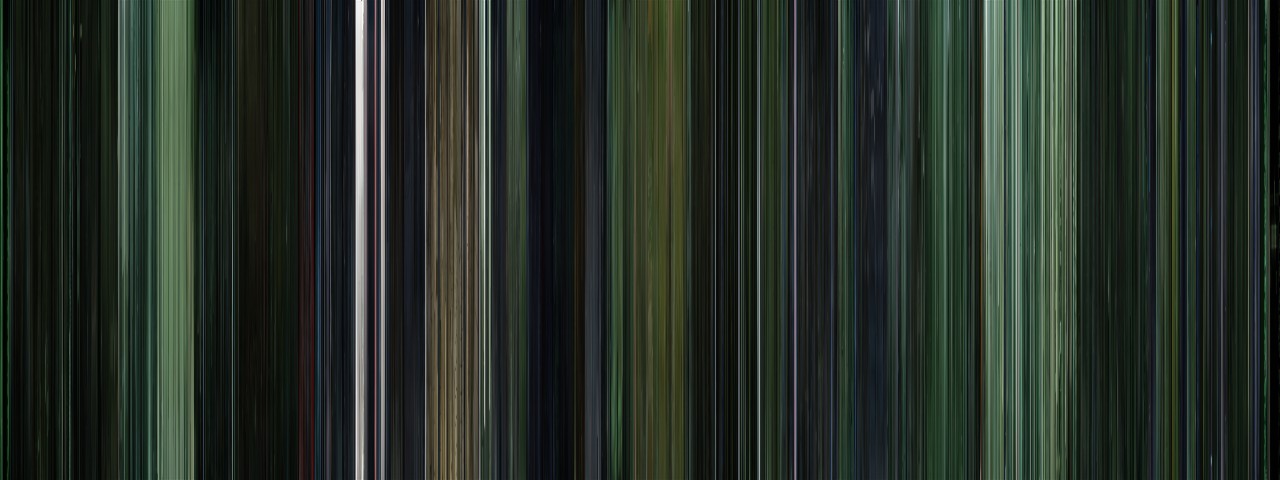
 The Matrix Barcode

Color to denote different storylines, time periods.  Many movies tell stories which jump back and forth in time.  Color can help navigate the audience through theses different places/time periods.  In the movie Hero, five colors are used as a symbol for five different story lines.  Can you tell me what the colors are?

Colors can also be used to show temperatures, emotions, personality traits, symbolism etc…


Colors work together in different ways.  Certain color combinations produce predictable and consistent visual effects.  Monochromatic harmony results from a scheme based on different tints and shades of one colorGreat Expectations, directed by Alfonso Cuarón has a monchromatic scheme.  What color is it?

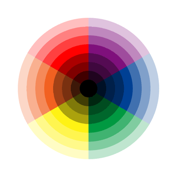
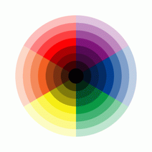
Complementary harmony results from the use of colors directly opposite each other on the color wheel.  These colors POP against eachother.

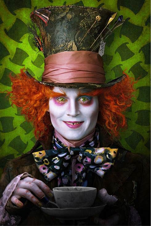
Tim Burton’s Mad Hatter character played by Johnny Depp uses a complimentary color scheme: red hair pops against the green background.

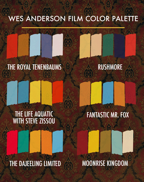
Graphic Designer Beth Mathews created the Wes Anderson Film color Palette.

Lets focus on the palette for The Life Aquatic.  Note the shades of blue, yellow and orange.  Now let’s watch the trailer for that movie.  Do you see how purposeful Anderson is with his colors?  Where do you see them?

Now that you have learned some about color, I want you to think about your digital story.  Choose, one, two, or three colors for the color palette of your movie.  You have already completed the Object Story Post, so hopefully you have thought a little about the mood of your movie.  Is it a funny story?  Sad, Scary, nostalgic?  What colors could you use to convey that mood?

Here is a some resources focusing on ideas typically associated with different colors that may help you:

Color Psychology

The Meaning of Colors

Color: Meaning, Symbolism and Psychology

 Once you have picked your color/colors, make a palette like Beth Mathews did using photoshop.  Create a new post entitled Digital Story Color Palette and post the palette image, along with the reasons that you chose to focus on those colors.

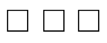
Here is a blank template to use for your color palette.  Click on it and save it!

Here is my Example:

Digital Story Color Palette

For my digital story, I will focus on the colors black and white.  The reason I am doing so is that my movie is about opposing forces in the universe, illustrated by my little black and white cats.  Black typically could represent evil, while white could represent good.  In the eastern philosophy of the yin yang, yin is black and yang is white.  Yin (WHITE) is slow, soft, yielding, diffuse, cold, wet, and passive; and is associated with water, earth, the moon, femininity and nighttime. Yang (BLACK),  is fast, hard, solid, focused, hot, dry, and aggressive; and is associated with fire, sky, the sun, masculinity and daytime.  I think it makes sense to do my movie in black and white.


*Most information in this post was taken from The Art of Watching Films by Joesph M. Boggs and Dennis W. Petrie